In the fast-paced landscape of global business, the importance of a strong and cohesive brand identity cannot be overstated. Today, we are thrilled to announce a significant milestone in our brand’s journey – the unveiling of our revamped visual identity. This transformation is not just a change in appearance; it’s a deliberate move towards a more unified and compelling representation of who we are. Join us as we delve into the details of this exciting evolution:
1. Symbolism in Simplicity:
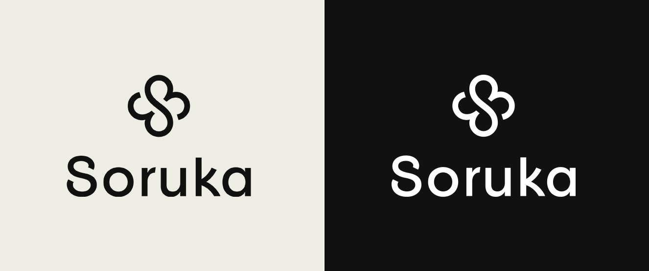
Our updated logo is a visual testament to the essence of simplicity and sophistication. It is a harmonious fusion of our three key elements—upcycling, nature, and the spirit of Soruka. It’s not just about aesthetics; it’s a profound statement about who we are and what we stand for.
2. Adapting to the Times:
Our updated visual identity reflects our dedication to evolving with the times. Embracing a modern and dynamic aesthetic, we aim not only to keep up but also to set the pace for the future, resonating with our audience in the present and beyond.
3. Aligning with Our Values:
The restyling journey has been more than a visual transformation; it’s been an introspective exploration of what our values truly mean to us and to those we serve. Through this process, we’ve gone beyond the surface, uncovering the nuances that make each of our values unique and impactful: conscious fashion, circular upcycling, living craft, perfect defects, uniqueness, versatility, honesty and Barcelona.
Thank you for being an integral part of our community. Here’s to a new chapter in our brand’s story!

